User Testing vs. User Teaching
What role does user testing play in the design practice, and what is our responsibility to progress our users’ visual literacy?

An example
When iOS 7 went into beta, I closely followed the evolution of the design as it moved through releases. I endured the crashes and glitches because it felt like being in the passenger seat of the product team as they worked out their design details.
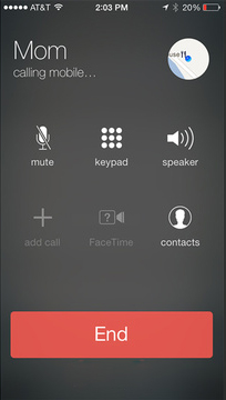
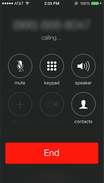
The part I was most interested in was the call screen. Just a few icons, a plain red bar to end a call, some text. No fuss. Simple.
Then something changed between beta 4 and beta 5. They redid the call screen. The icons now had circle outlines and the end call bar was changed.
iOS call screen — beta 4 (left) vs. beta 5 (right)

Why?
I irrationally disliked this change. The reason, I found out, was user testing — people didn’t know they could tap the icons. I found it hard to believe that someone wanting to mute a call wouldn’t think to tap the thing that says “mute.” This was not a satisfying answer.
I remember thinking Apple had missed an opportunity to push their customers. Millions of people were going to use this interface. Even if it took an extra second the first time, they would have it by the second. It would be normal by the third.
My take was overdramatic. I’ve since come to like the call screen and watched it evolve well. But my reaction raised questions I’ve kept thinking about: what role should user testing play, and what responsibility do we have to improve users’ visual literacy?
What role does user testing play in the design practice, and what is our responsibility to improve our users’ visual literacy?

The user is always right…
At IBM, user research was a pillar of how we worked. For decades the company had built products disconnected from the people using them — and the results were visible. The “user first” reset was serious and necessary.
I was not the user of the products I designed. I relied on research to understand whether showing REST resources a certain way mapped to how engineers actually thought, how often someone needed to add an on-premise network connection, how many Salesforce objects they expected to sync. These are not questions a designer can answer from instinct.
I didn’t learn how to design an API creation tool in design school. I learned how to listen to users. I don’t want to understate how much that’s worth.

…except when they aren’t
But I don’t want to see a world where the designer becomes a middleman. It’s easy to take “user first” and extrapolate it into A/B testing every design decision.
The role of the designer has evolved. In the craft era, the tool was the hand. Computers brought machined precision. Now that algorithms can generate infinite variations, the designer risks becoming only a curator — or worse, delegating choices to the user directly. What color blue does the user prefer? The designer becomes a facilitator serving up whatever the user says they want.
But users are often wrong. I was wrong about iOS 7. Think about how loudly people complained every time Facebook changed its layout — and how little anyone would want to go back to 2007. Testing is one tool in the repertoire. It shouldn’t be all of them.

Finding Balance

Where is the balance? I think it lies in understanding what kind of decision you’re making. In Allen Hurlburt’s “The Design Concept,” he diagrams the creative process as moving between analytical and intuitive thinking. I find the distinction useful.
Analytical decisions have objective answers: does this solve the actual problem? Do people understand it? Does it work? Users are essential here. But good products aren’t built on analytical decisions alone. We cannot neglect the intuitive side of the creative process.

Teachers of what?
There are decisions we should not delegate to our users. Through experience, practice, and deep familiarity with the materials, designers can go beyond what users expect — or can imagine.
The fact that designers have expertise implies there will be times we decide things the user would not have chosen. That’s not a failure of the process. That’s the process working.
When we expose users to design over time, we shape their expectations. Designers develop users’ visual literacy. We have a responsibility to progress it, not simply reflect it.
“Even if it is true that the average man seems most comfortable with the commonplace and familiar, it is equally true that catering to bad taste… merely perpetuates the mediocrity and denies the reader one of the most easily accessible means for aesthetic development and eventual enjoyment.” — Paul Rand

Rand believed in “aesthetic development” — designers as agents who expand what their audience is capable of appreciating. When we push past the familiar, we change visual literacy. Our aesthetics have always changed over time. The question is whether that change is drift or progression. Progression implies a destination.

Where are we going?
Type design makes this visible. The way we draw letters has changed radically across time and culture. We can barely read blackletter; a medieval reader would struggle with Helvetica. It’s not only time — subcultures develop lettering in completely different directions simultaneously.
This is why I don’t believe in absolute beauty — no golden standard a design can be held against independent of its context. Rand is right that there is aesthetic development. But I don’t think it moves toward a fixed point in the visual or concrete.
The ideal design decision is highly dependent on its variables. We are not working with simple equations — we deal with complex landscapes of unique users. Time is a variable. Location. Age. Industry. Prior experience. These equations ask us to solve for the whole alphabet.


Solving for variables
The design research process is about filling in context so our designs have the best chance of resonating. Some context is fixed — how the human eye perceives light, the underlying mathematics of visual perception. These give us basic design principles. But they don’t paint a detailed enough picture of the environments we actually design for. User research fills the gaps.

Setting expectations
So what do we teach, if there is no single archetype of visual literacy to develop toward? Not to love Helvetica or hate drop-shadowed Comic Sans. Not even to prefer generous whitespace. We need to step back from “what they like” and ask “why they like it.”
We should teach users to appreciate design that is bespoke and contextual — because there are times Helvetica is not the right choice. By learning why it works in some scenarios, they become able to sense why it fails in others. The way we develop that capacity is to keep serving designs that genuinely respond to specific needs and contexts.
In some ways, we need to teach users to be spoiled. And if we’re lucky, they’ll hold us accountable — and end up teaching us.
A version of this talk was presented at UX+DEV Summit, Miami (2017) and INTERACT, Mumbai (2017). Originally published January 2016.